Inside every one of us, a complex system of microflora makes us who we are—literally. These little helpers fuel our digestive system, break down food, fight disease, make vitamins, and more. Sometimes they need a little extra fuel to help them thrive. That’s where Benefiber comes in.
The challenge: Breaking through in a crowded gut health space and explain a fiber supplement’s relationship with our gut biome.
The solution: We developed TV, online video, and social spots that simplified the message with a garden metaphor. Our campaign showed how Benefiber’s prebiotic fiber gently nourishes the hardworking good bacteria in your gut and helps them flourish, so you can too.
Agency: Weber Shandwick
Client: Haleon
My Role: Creative Director
Seattle is one of the fastest growing cities in America, which puts the Seattle Department of Transportation in the very unenviable position of managing an increasingly complicated transit infrastructure.
The challenge: Reduce the number of single-occupancy vehicles commuting to and from center city (downtown).
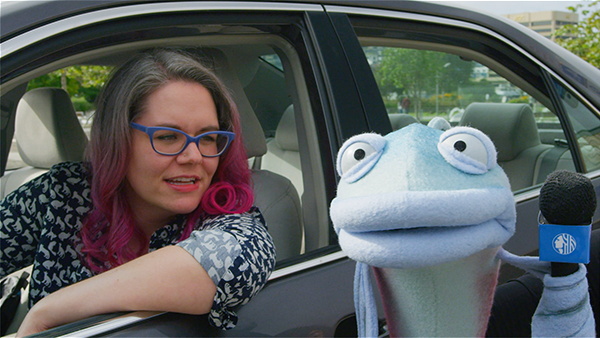
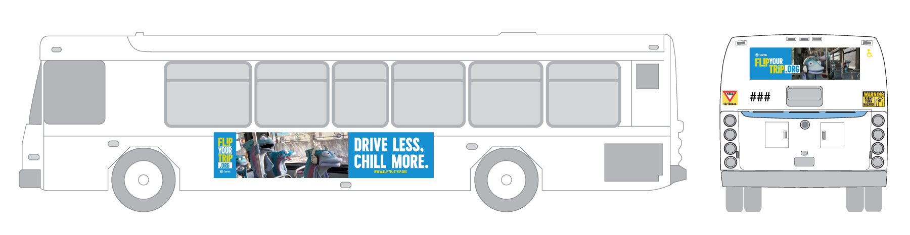
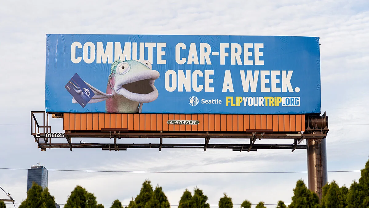
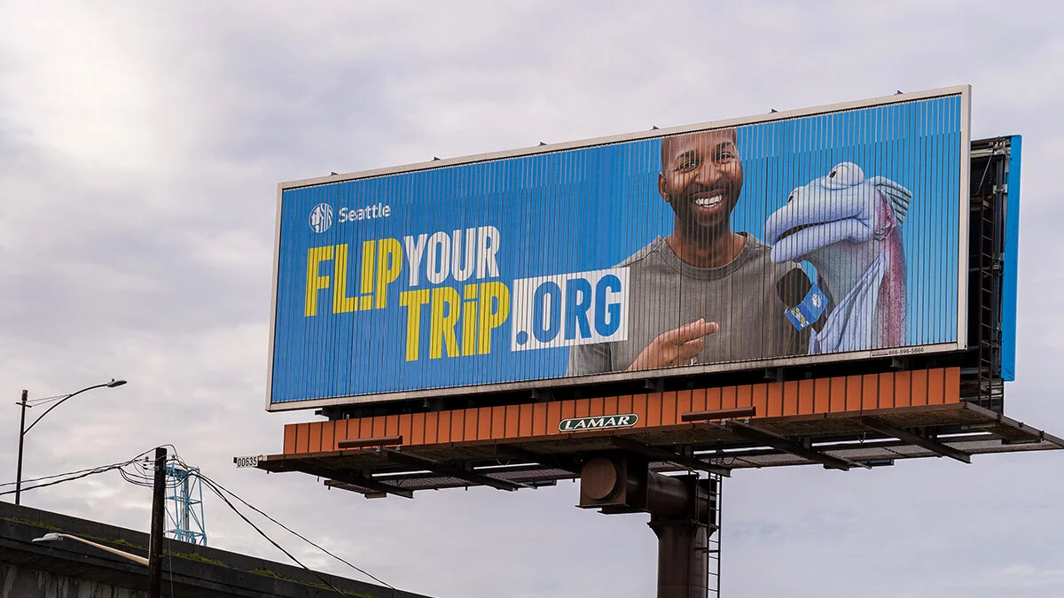
The solution: Sal (short for Sally), a foul-mouthed talking salmon. “Flip Your Trip”—a three-year, 360 campaign that includes video digital, social, billboards, and bus ads—uses humor and engaging content to encourage commuters to choose alternate forms of transport at least once a week.
Why a salmon? Because few things are more emblematic of the Pacific Northwest and, like Seattle commuters, they are well familiar dense traffic and long travel times. Why a salmon puppet? Who doesn’t love puppets?
Agency: Weber Shandwick
Client: Seattle Department of Transportation
Creative Director: Heather Bradley
Puppet Designer/maker: Adam Kreutinger
Performer: Stephani Vrell Sachs
My Role: ACD / Art Director / Studio Photographer
American Muslims face discrimination and inequity fueled by ignorance and negative bias. The Council on American-Islamic Relations (CAIR) and the Muslim Association of Puget Sound strive every day to confront that bias and help Americans better understand their Muslim neighbors.
The challenge: Reach out to Washington State’s “persuadable middle”— people with open minds, who maybe lack everyday exposure to Muslims or Islam, which leaves them with limited cultural understanding—and deliver a simple message: American Muslims are people worthy of the same rights, dignity, and respect as anyone else.
The solution: #SharingOur Stories—a campaign designed to “humanize the other.” We produced a set of short, visually rich, emotionally relatable stories told by real Muslim Washingtonians. The videos were posted on owned channels—website, Twitter, Facebook—and viewers were invited to engage by sharing similar stories of their own.
Agency: Weber Shandwick
Client: CAIR Washington / MAPS-AMEN
Animator: Gus Hinton
Writer: Emeline Cokelet-Meneken
My Role: Creative Director
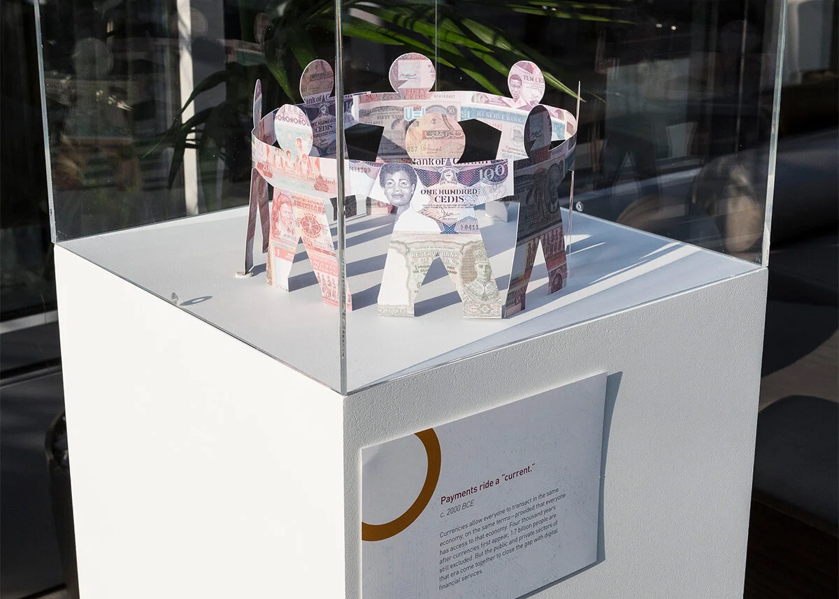
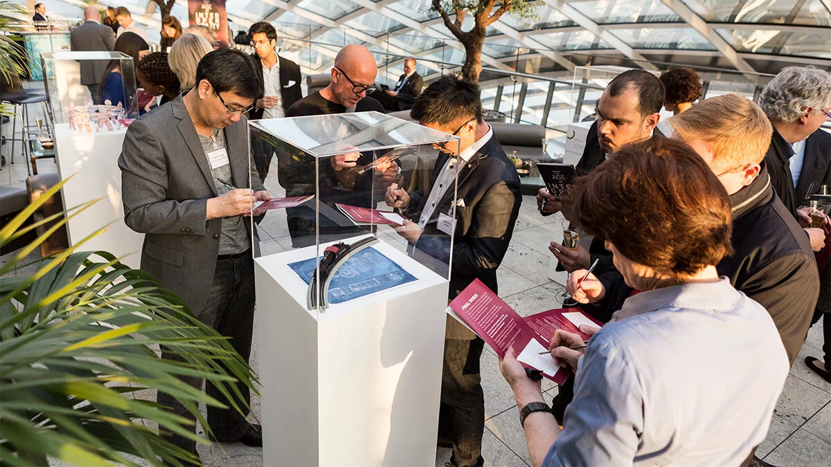
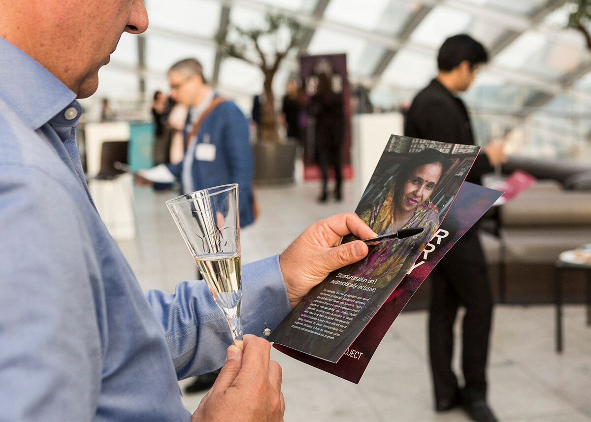
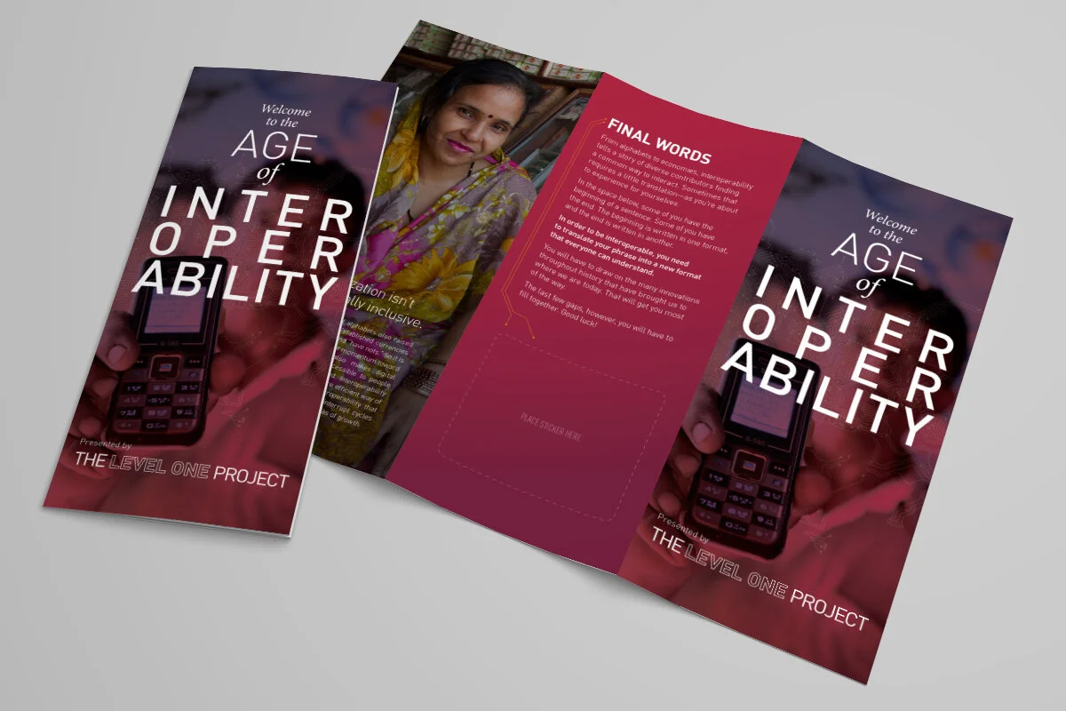
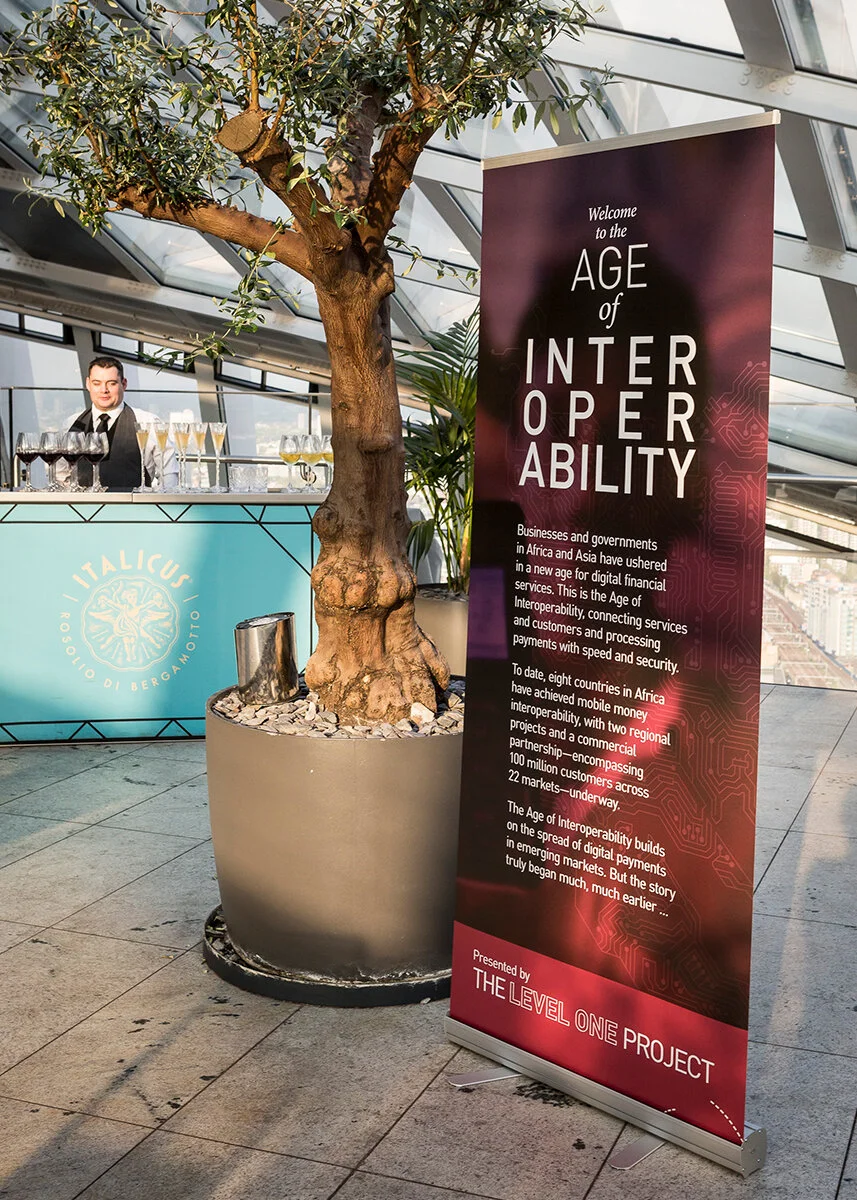
In Africa and around the world, millions of people are still unable to participate in the digital economy because they lack access to simple, secure, digital financial services. The Bill & Melinda Gates Foundation, though the Level One Project and its open-source Mojaloop platform, hopes to change that. But change requires support.
The challenge: Break through to financiers and regulators with the message that everyone benefits from an economy that includes everyone.
The solution: “The Age of Interoperability,” a museum exhibition that explores the history of finance and demonstrates why equipping the world’s unbanked populations with digital financial services is not only profitable, but essential to a healthy global economy. We invited a select group of bankers, regulators, and investors to London’s Sky Garden and asked them solve a puzzle. Clues were hidden within each exhibit, and they had to work together to find the solution—all over cocktails, of course.
Agency: Weber Shandwick
Client: Bill & Melinda Gates Foundation
Writer: Mike Mathieu
My Role: CD / Art Director
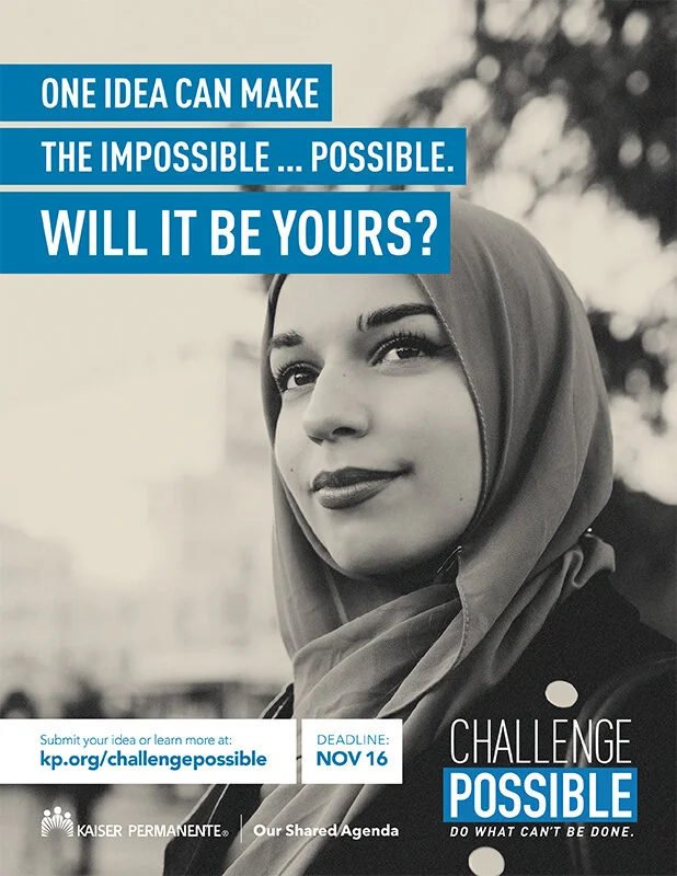
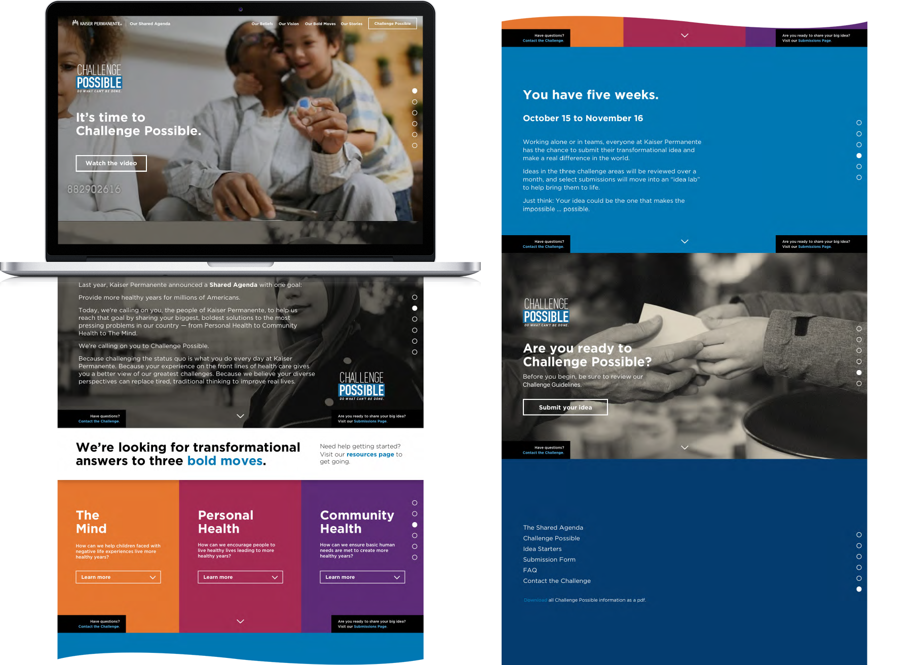
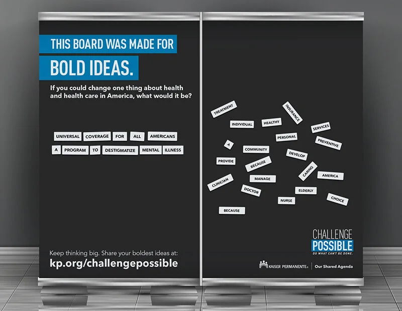
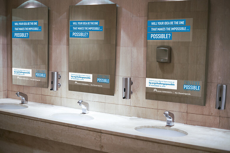
Kaiser Permanente is focused on solving some of the biggest problems currently facing healthcare. Big problems require big ideas. So, they turned to one of the largest sources of innovative ideas they could find—their own network of health care professionals.
The challenge: Get KP employees excited to contribute bold new ideas about how to solve problems related to Personal Health, Community Health, and The Mind (childhood mental health).
The solution: Challenge Possible—a massive internal communications campaign that included video, a custom microsite, posters & signage, digital ads, and a leadership town hall. We reached out to Kaiser Permanente’s thousands of employees where they were—offices & clinics, intranet sites, break rooms, and even restrooms—across the U.S. The response was extremely positive, generating dozens of usable ideas, kudos from our client, and a PRSA Silver Anvil Award.
Agency: Weber Shandwick
Client: Kaiser Permanente
Co-Creative Director: Juliet Fox (copy)
My Role: Co-Creative Director (art & design)
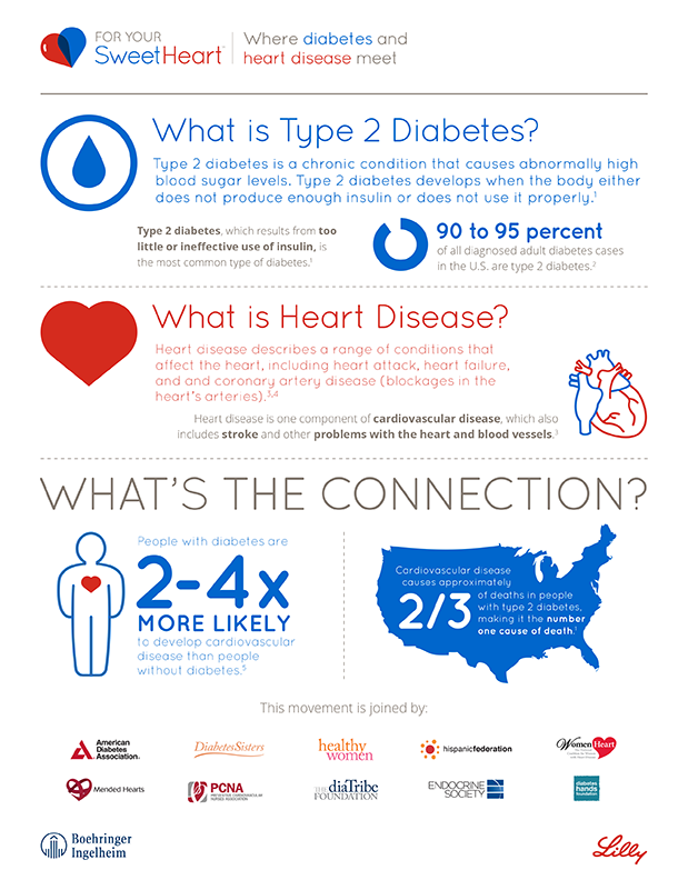
People with type 2 diabetes are 2-4 times more likely to develop cardiovascular disease than people without diabetes. And more than half (52%) of adults with type 2 diabetes do not understand that risk. Pharmaceutical giants Boehringer Ingelheim and Eli Lilly Company partnered to change that.
The challenge: Raise awareness of the link between type 2 diabetes and heart disease.
The solution: For Your SweetHeart, an awareness campaign joined by 11 leading patient and professional advocacy groups, six top cardiologists and endocrinologists, Angela Bassett (award-winning actress), and Dr. Travis Stork (board-certified emergency medicine physician and host of the Emmy-nominated show The Doctors). Through earned and owned content, we directed audiences to a microsite that hosted a questionnaire—the Heart You Quiz—and other resources that that encouraged them learn about their risk and talk to their healthcare providers.
Client: Boehringer Ingelheim & Eli Lilly Company
Creative Director: Peter Matheson Gay
My Role: Art Director
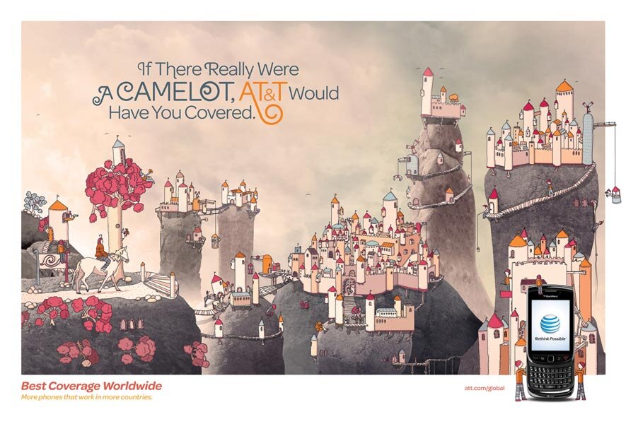
Agency: BBDO Worldwide
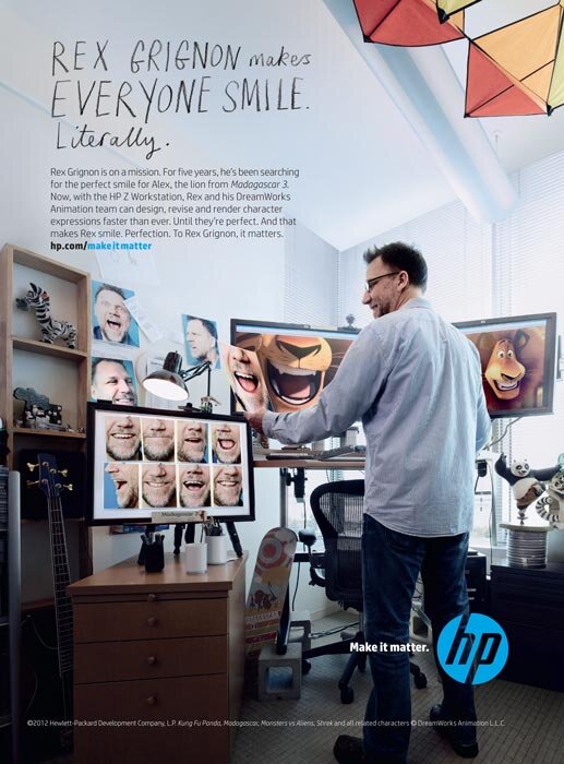
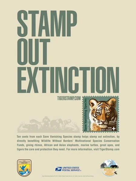
Clients: Home Box Office; Gillette; Starbucks; AT&T; Mars, Inc.; Hewlett Packard, Empire State Development; USPS/U.S. Fish & Wildlife Reserve
My Role: Production Designer
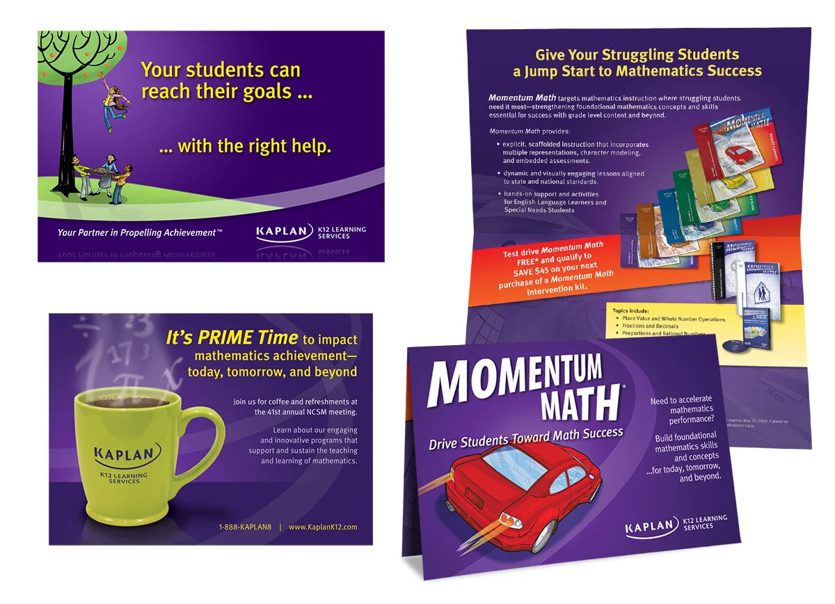
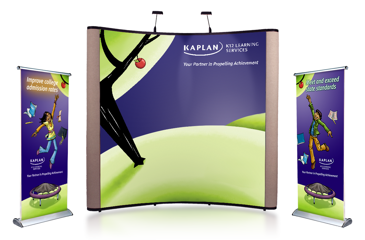
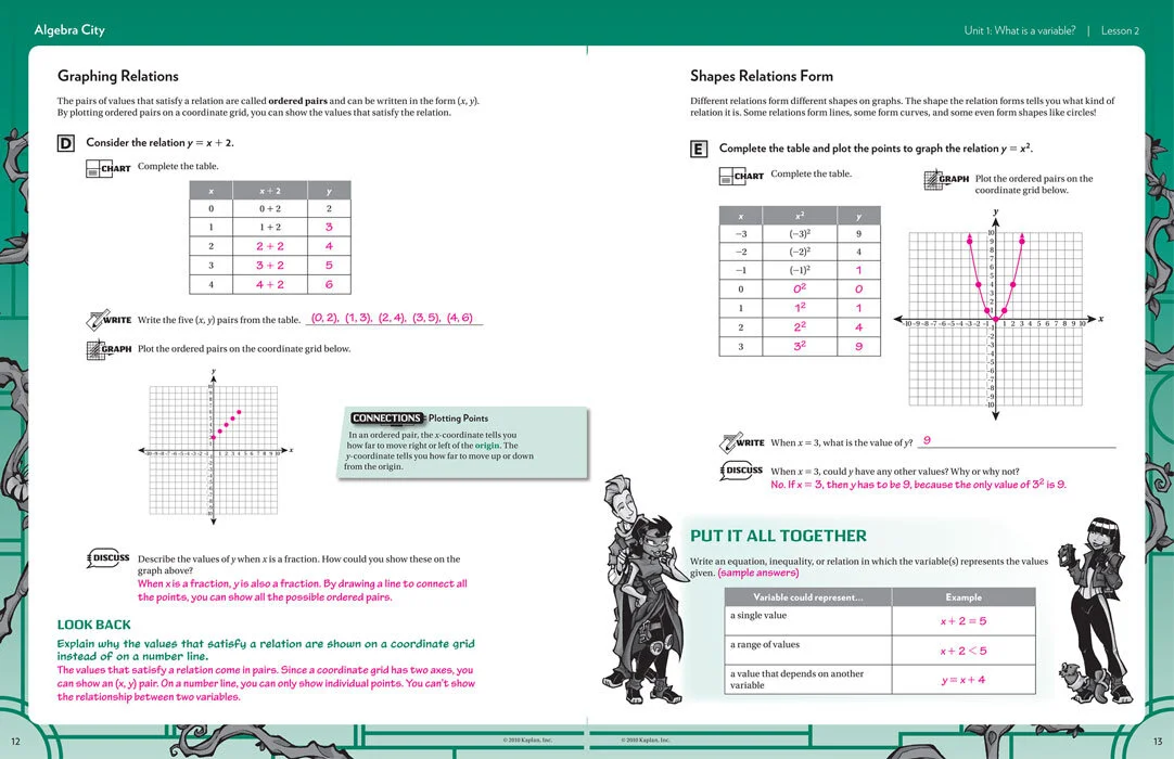
Kaplan, Inc. is a leader in standardized test preparation, most famous for its SAT, ACT, and GRE courses. For almost a decade, I led the creative team of Kaplan K12 Learning Services, a division focused on generalized curriculum and skill-building—not just standardized testing—in the K-12 space.
Kaplan was a my first job after college. I was hired as an Editorial Assistant, but that role quickly grew into production design, production management, art direction and, eventually, creative direction. I oversaw a team of more than a dozen—writers, designers, art directors, and illustrators—that was responsible for the myriad products and sales support pieces that Kaplan K12 produced. I also spearheaded and oversaw a company-wide re-branding effort that included an updated brand guidelines and new website.
Kaplan K12 was ultimately a victim of the 2008 recession, but it provided countless learning opportunities and was a wonderful introduction to the professional world.
Company: Kaplan K12 Learning Services
My Role: Creative Director / Art Director / Designer
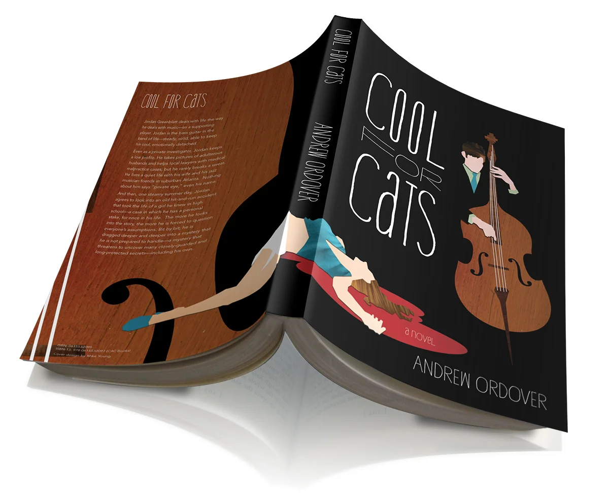
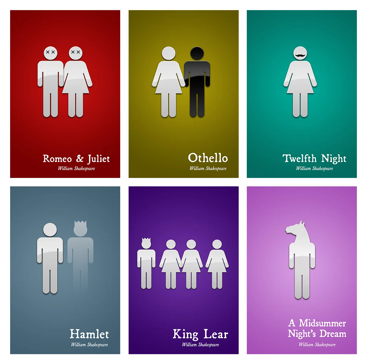
Full disclosure: all but Cool for Cats were personal projects. Inspired boredom.
The horror/sci-fi novels were an exercise to see if I could strip down classic stories into single, iconic visual elements. The Shakespeares are probably a dumb joke taken too far. The Secret Royal Society and This Cursed Host were meta projects—books that existed within works created by friends.
I included these because they were fun to make, but also because they provide insight into my aesthetic sensibilities—minimalism that doesn’t take itself too seriously.